Although UX and accessibility experts won’t like this customization, it’s still important to know “what’s possible” with WooCommerce.
In regard to the checkout form (billing + shipping + notes), there is a useful “woocommerce_checkout_fields” hook (filter) that is widely used by developers like me to alter the behavior of input fields.
In today’s episode we will take a look, indeed, at how to remove the checkout field labels from their default position (above fields), and use them as placeholders instead, so that we save up some vertical space.
Enjoy!
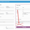
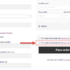
Once the snippet below is active, your WooCommerce checkout fields will look like this; field labels will now display inside their respective input fields.
This code still works, unless you report otherwise. To exclude conflicts, temporarily switch to the Storefront theme, disable all plugins except WooCommerce, and test the snippet again: WooCommerce troubleshooting 101
Related content
WooCommerce: Cart and Checkout on the Same Page This is your ultimate guide – complete with shortcodes, snippets and workarounds – to completely skip the Cart page and have both cart table and checkout form on the same (Checkout) page. But first… why’d you want to do this? Well, if you sell high ticket products (i.e. on average, you sell no more than […]
WooCommerce: Disable Payment Method If Product Category @ Cart Today we take a look at the WooCommerce Checkout and specifically at how to disable a payment gateway (e.g. PayPal) if a specific product category is in the Cart. There are two tasks to code in this case: (1) based on all the products in the Cart, calculate the list of product categories in the […]
WooCommerce: Add Privacy Policy Checkbox @ Checkout Here’s a snippet regarding the checkout page. If you’ve been affected by GDPR, you will know you now need users to give you Privacy Policy consent. Or, you might need customer to acknowledge special shipping requirements for example. So, how do we display an additional tick box on the Checkout page (together with the existing […]
WooCommerce: Redirect to Custom Thank you Page How can you redirect customers to a beautifully looking, custom, thank you page? Thankfully you can add some PHP code to your functions.php or install a simple plugin and define a redirect to a custom WordPress page (as opposed to the default order-received endpoint). This is a great way for you to add specific up-sells, […]
WooCommerce: Disable Payment Gateway by Country You might want to disable PayPal for non-local customers or enable a specific gateway for only one country… Either way, this is a very common requirement for all of those who trade internationally. Here’s a simple snippet you can further customize to achieve your objective. Simply pick the payment gateway “slug” you want to disable/enable […]
Rodolfo Melogli
Business Bloomer Founder
Author, WooCommerce expert and WordCamp speaker, Rodolfo has worked as an independent WooCommerce freelancer since 2011. His goal is to help entrepreneurs and developers overcome their WooCommerce nightmares. Rodolfo loves travelling, chasing tennis & soccer balls and, of course, wood fired oven pizza. Follow @rmelogli
10 thoughts on “WooCommerce: Move Labels Inside Checkout Fields”
Gregory Pinkwater
Hello,
Could you show us how to edit the code so that we can assign this to specific fields, rather than all fields?
Hi Gregory, thanks so much for your comment! Yes, this is definitely possible, but I’m afraid it’s custom work. If you’d like to get a quote, feel free to contact me here. Thanks a lot for your understanding!
Possible to notify user if a field is required of not? As it looks like now it not very good UX. User do not know what fields are required and what are optional
I actually had the same question coming here. The missing fields are marked red if the user tries to checkout but he has no way of knowing in advance, which fields are considered required.
I am guessing Ryan Logan had the same question/issue above.
It seems to be a question of either having everything inline but no required field indicator or keeping everything as is to keep he asterisks. Is there any way out of this dilemma?
Hey Michael, I take the placeholder could take an “*” if the field is required, or you could style field borders via CSS. I’m afraid this is custom work – if you’d like to get a quote, feel free to contact me here. Thanks a lot for your understanding!
Hello all,
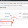
For me, the following solution worked well. It adds an asterix for required fields and (optional) for not-required fields. You can change it to whatever you need in the code. Hope it works for you too.
Questions? Feedback? Customization? Leave your comment now! _____
If you are writing code, please wrap it like so: [php]code_here[/php]. Failure to complying with this, as well as going off topic or not using the English language will result in comment disapproval. You should expect a reply in about 2 weeks - this is a popular blog but I need to get paid work done first. Please consider joining the Business Bloomer Club to get quick WooCommerce support. Thank you!


Hello,
Could you show us how to edit the code so that we can assign this to specific fields, rather than all fields?
Hi Gregory, thanks so much for your comment! Yes, this is definitely possible, but I’m afraid it’s custom work. If you’d like to get a quote, feel free to contact me here. Thanks a lot for your understanding!
Awesome stuff! Now, if we can only get the asterisk to remain for required fields. ; )
🙂
Hello,
Possible to notify user if a field is required of not? As it looks like now it not very good UX. User do not know what fields are required and what are optional
WooCommerce should already change the border to red for required fields, can you see that? Let me know
I actually had the same question coming here. The missing fields are marked red if the user tries to checkout but he has no way of knowing in advance, which fields are considered required.
I am guessing Ryan Logan had the same question/issue above.
It seems to be a question of either having everything inline but no required field indicator or keeping everything as is to keep he asterisks. Is there any way out of this dilemma?
Hey Michael, I take the placeholder could take an “*” if the field is required, or you could style field borders via CSS. I’m afraid this is custom work – if you’d like to get a quote, feel free to contact me here. Thanks a lot for your understanding!
Hello all,
For me, the following solution worked well. It adds an asterix for required fields and (optional) for not-required fields. You can change it to whatever you need in the code. Hope it works for you too.
add_filter( 'woocommerce_checkout_fields', 'bbloomer_labels_inside_checkout_fields', 9999 ); function bbloomer_labels_inside_checkout_fields( $fields ) { foreach ( $fields as $section => $section_fields ) { foreach ( $section_fields as $section_field => $section_field_settings ) { if ($fields[$section][$section_field]['required'] == true) { $fields[$section][$section_field]['placeholder'] = $fields[$section][$section_field]['label'] .= '*'; } else { $fields[$section][$section_field]['placeholder'] = $fields[$section][$section_field]['label'] .= ' (optional)'; } $fields[$section][$section_field]['label'] = ''; } } return $fields; }Thanks!