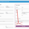
WooCommerce frontend messages and error notifications display on the Single Product page, Cart page, Checkout page, My Account page and may show on page load or upon a specific user action.
The potential problem is that – same as the WordPress backend – WooCommerce messages can use a lot of vertical space, hence can push useful content further down the page, and possibly disturb the navigation – especially on the Checkout page.
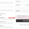
A cool workaround may be to place a dismiss “x” button on the WooCommerce notices, so that customers can quickly close them and gain back some space.
We will use a mix of PHP, JS and CSS in the snippet below in order to achieve our final goal. Enjoy!

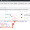
PHP + JS Snippet: Add a Dismiss Button @ WooCommerce Checkout Message & Error Notifications
/**
 * @snippet       Close Button @ WooCommerce Checkout Notifications
 * @how-to        Get CustomizeWoo.com FREE
 * @author        Rodolfo Melogli
 * @compatible    WooCommerce 7
 * @community     https://businessbloomer.com/club/
 */

add_action( 'wp_loaded', 'bbloomer_dismiss_woocommerce_message' );

function bbloomer_dismiss_woocommerce_message() {
	if ( is_admin() ) return;
	wc_enqueue_js( "
		$(document).on('updated_checkout checkout_error',function(){
			$('.woocommerce-message,.woocommerce-info,.woocommerce-NoticeGroup-checkout').each(function(){
				if (!$(this).find('.dizmiz').length) $(this).append('<span class=\'dizmiz\' title=\'Dismiss\'>x</span>').css('position','relative');
			});
		});
		$(document).on('click','.dizmiz',function(){
			$(this).parent().hide(600);
		});
	" );
}
CSS Snippet: Style the Dismiss Button
.dizmiz {
    right: 1em;
    top: 1em;
    position: absolute;
    background: black;
    border-radius: 50%;
    height: 23px;
    width: 23px;
    line-height: 23px;
    font-size: 17px;
    text-align: center;
    color: white;
    font-weight: 900;
    cursor: pointer;
}


hello and thank you but not compatible with latest woocommerce version.
Could I have some more context? Do you use blocks?
Thank you. it worked on checkout page but didnt work on cart page and single product page. How can it affect all woo commerce messages?
Great! Some of the jQuery logic needs to be changed/added so that you can target any notification. I’m afraid it’s custom work. If you’d like to get a quote, feel free to contact me here. Thanks a lot for your understanding!