WooCommerce 3.0 completely revolutionized the single product page featured and product gallery images, including their PHP. If, in the past, a simple filter from WooCommerce was enough to change the number of thumbnails per row (https://docs.woocommerce.com/document/change-number-of-thumbnails-per-row-in-product-galleries/), this does not exists anymore 🙁
So, let’s see how we can achieve this in WooCommerce 3.0 and above. For this example we’ll use two themes – in fact some theme-specific CSS is also needed together with the PHP.

PHP Snippet: Change No. of Thumbnails per Row @ Product Gallery | WooCommerce
/**
 * @snippet       Change No. of Thumbnails per Row @ Product Gallery
 * @how-to        businessbloomer.com/woocommerce-customization
 * @author        Rodolfo Melogli, Business Bloomer
 * @testedwith    WooCommerce 5.0
 * @community     https://businessbloomer.com/club/
 */

add_filter( 'woocommerce_single_product_image_gallery_classes', 'bbloomer_5_columns_product_gallery' );

function bbloomer_5_columns_product_gallery( $wrapper_classes ) {
   $columns = 5; // change this to 2, 3, 5, etc. Default is 4.
   $wrapper_classes[2] = 'woocommerce-product-gallery--columns-' . absint( $columns );
   return $wrapper_classes;
}
Unfortunately this filter is usually not sufficient as WordPress themes apply their own CSS to the new Product Gallery. So, let’s see what else is needed to make it all work.
CSS to be added for TwentySeventeen Theme (Change No. of Thumbnails per Row @ Product Gallery)
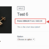
Please note: this blog’s featured image is the result of PHP + CSS on the TwentySeventeen Theme.
/* Remove default "clear" at position 5, 9, etc. This is for 4 columns */

.woocommerce-product-gallery .flex-control-thumbs li:nth-child(4n+1) {
    clear: none;
}

/* Add new "clear" at position 6, 11, etc. This is for 5 columns */

.woocommerce-product-gallery .flex-control-thumbs li:nth-child(5n+1) {
    clear: left;
}
CSS to be added for Storefront Theme (Change No. of Thumbnails per Row @ Product Gallery)
/* Add new CSS for 5 columns */

.single-product div.product .woocommerce-product-gallery.woocommerce-product-gallery--columns-5 .flex-control-thumbs li {
    width: 11.1%;
    margin-right: 11.1%;
float: left;
}

.single-product div.product .woocommerce-product-gallery.woocommerce-product-gallery--columns-5 .flex-control-thumbs li:nth-child(5n) {
    margin-right: 0;
}
Final result:


Hi there,
the code work well on desktop / tablet but not for mobile devices.
I set 5 column but on mobile i still have 4 columns.
Can you help me?
Hi there, it must be your theme or a different plugin interfering with that. It will require custom troubleshooting. If you’d like to get a quote, feel free to contact me here. Thanks a lot for your understanding!
Hello, I just fixed that Firefox width issue by overwriting the minified jquery file from woocommerce/assets/js/flexslider/jquery.flexslider.min.js
I changed this : `m.isFirefox&&(m.w=m.width())`
To this : `m.isFirefox&&(m.w=m.viewport())`
It will use the width of the **viewport** in place of the entire slider.
Wish this can help! Its worked perfectly for me as i use the thumbmails on left side.
Cool
Thank you! This helped me with a very quick fix to remove the line breaks with images. Much appreciated.
Cool
Hi Rodolfo, excellent tip.
Another way it’s to hook before woocommerce_single_product_image_gallery_classes and return the number of columns that also generate the correct data-columns number in the div (with the correct class); something like this works fine:
/** * Change Single product photo gallery number of columns. */ add_filter( 'woocommerce_product_thumbnails_columns', function() { return 7; } );Thanks!
I just wanted to drop in and say thank you, Carlos!
I need 10 columns.. how should i adjust it? thanks
Hi Dale, you would put 10 instead of 5, and then based on your theme you may also need some additional custom CSS
In Customizr Pro You only have to change CSS without adding any changes to functions.php:
/* remove clear for every 4th image */ .woocommerce div.product .woocommerce-product-gallery--columns-4 .flex-control-thumbs li:nth-child(4n+1) { clear: none; } /* add clear for every 6th image (change for yourself) */ .woocommerce div.product .woocommerce-product-gallery--columns-4 .flex-control-thumbs li:nth-child(6n+1) { clear: left; } /* Resize image, for default is 25%, for 5 is 20%, for 6 is 16.666%, etc. */ .woocommerce div.product div.images .flex-control-thumbs li { width: 16.666%; }Cool, but you will also need to add responsive CSS right? 🙂
snippet did not work for me, using Genesis Frameworks theme. My client has 1 product with only 2 thumbs that she wants centered under the main photo, I was hoping this would help but no changes are seen.
Thanks for your comment Jan! I guess Genesis has its own code so the snippet would need to be modified slightly 🙂