By default, WooCommerce displays 4 products per row in the shop page. This is ok for almost any ecommerce website, however in certain cases you might want to change this setting in order to show full-width products (a.k.a. one product per row).
In this post we’ll look at the alternatives you have in regard to changing this setting, and also some CSS adjustments to make the 1-product-per-row shop page look better. Enjoy!

PHP Snippet: Change Number of Products per Row @ WooCommerce Shop Page
/**
 * @snippet       1 Column Layout @ WooCommerce Shop
 * @how-to        businessbloomer.com/woocommerce-customization
 * @author        Rodolfo Melogli, Business Bloomer
 * @testedwith    WooCommerce 8
 * @community     https://businessbloomer.com/club/
 */

add_filter( 'loop_shop_columns', 'loop_columns', 999 );

function loop_columns() {
   return 1;
}
CSS Snippet: Centered Layout @ WooCommerce Shop Page
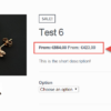
Once you have “1 product per row” in place, you might get a result similar to this (basically, despite you have one product per row, they don’t take full width and therefore the layout doesn’t look right):

Which means we also need to make use of some CSS in order to move the products and center align them.
/**
 * @snippet       Stretch Products to Full Width @ WooCommerce Shop
 * @how-to        businessbloomer.com/woocommerce-customization
 * @author        Rodolfo Melogli, Business Bloomer
 * @testedwith    WooCommerce 8
 * @community     https://businessbloomer.com/club/
 */

ul.products li.product .woocommerce-loop-product__link {
    margin: 0 auto;
}

ul.products li.product .button {
    margin: 0 auto;
}
The final result is shown at the top of this page.
If you also want to change the dimensions of your product images, go to WordPress Dashboard > Appearance > Customize > WooCommerce > Product Images and make sure the width of your Catalog images is at least 1000px.
Advanced Plugin: WooCommerce Product Table
For a code-free solution, I found a reliable plugin that achieves a similar result to this snippet (and much more). This is a great option if you don’t want to code or aren’t comfortable with PHP.
As we saw above, displaying one product per row using the normal WooCommerce store layout doesn’t look quite right unless you add some extra CSS to fix the alignment. The WooCommerce Product Table plugin fixes this problem in a way that makes much better use of space.
It does this by displaying one product per row in a structured table layout. You can add multiple columns of product data to the table, which fills the width of the page while providing extra information for customers. For example, you can add columns for the product image, name, short description, add to cart buttons, and any other type of product data.

The table layout also comes with extra features that can improve the customer experience. For example, you can add a search box and filters above the table to help customers to find products more easily. Overall, it’s probably a better way to display one product per row because the table layout lends itself perfectly to this format.


Thanks for sharing.
Please I would like to find out how to use the one product per row code to apply for only mobile version.
Thank you.
Hi Adam, thanks so much for your comment! Yes, this is definitely possible, but I’m afraid it’s custom work. If you’d like to get a quote, feel free to contact me here. Thanks a lot for your understanding!
Is it also possible to make this function true for mobile only? Since I would like my site to show 3 columns on desktop and only 1 for mobile. Thanks in advance!
Hi Mark, thanks so much for your comment! Yes, this is definitely possible, but I’m afraid it’s custom work. If you’d like to get a quote, feel free to contact me here. Thanks a lot for your understanding!