You know, that’s one of the biggest WooCommerce display issues.
Products may have images of different proportions, different title lengths, some have review stars and some don’t, making the “product grid” layout (product archive template) a big mess. You’d be very familiar with the below screenshot I guess.
So, here are a few options you have to make the display consistent. Enjoy!

Solution 1: Using Consistent Elements (Images, Titles, etc.)
Step 1: Force Image Height
The first step is to make image heights consistent. This can be achieved via the “Customizer” under WordPress Dashboard > Appearance > Customize > WooCommerce > Product Images and you have to choose between “Images will be cropped into a square” or “Images will be cropped to a custom aspect ratio”. In this way, if you uploaded big enough images, you will get this result:

Step 2: Make Product Titles Consistent
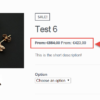
The second issue is that product names can go over 2, 3, n lines based on their length. If, in the screenshot above, “Simple 3” were instead “Simple 3 with an incredible view of the Northern Mountains”, obviously the height between this product and the next ones would have been different.
In case you have inconsistent product title lengths, check this other tutorial of mine to make them equal. If they’re all of the same length, they should take the same height of course.
Step 3: Remove Product Information
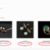
Last step is to remove the information that is causing the product “box” to take a custom height. If all products only had IMAGE – NAME – PRICE – BUTTON it would be evident they’d take the same height!
So one option is to remove the stuff that WooCommerce adds to the shop page products: the SALE badge (which in Storefront theme is not positioned over the image but inside its own div) and the review stars – without them products would be consistent in height:

So, here comes the Visual Hook Guide for the Shop page. We can see WooCommerce adds SALE and REVIEWS with two functions, so we can remove them in our child theme:
/**
 * @snippet       Remove Sale & Reviews @ WooCommerce Shop
 * @how-to        businessbloomer.com/woocommerce-customization
 * @author        Rodolfo Melogli, Business Bloomer, BusinessBloomer.com
 * @testedwith    WooCommerce 8
 * @community     https://businessbloomer.com/club/
 */

add_action( 'woocommerce_before_shop_loop', 'bbloomer_product_archive_remove_sale_reviews' );

function bbloomer_product_archive_remove_sale_reviews() {
   remove_action( 'woocommerce_before_shop_loop_item_title', 'woocommerce_show_product_loop_sale_flash', 10 );
   remove_action( 'woocommerce_after_shop_loop_item_title', 'woocommerce_template_loop_rating', 5 );
}
Solution 2: Equal Height Columns + Add to Cart Button to Bottom
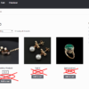
The reason why buttons appear at different heights is that WooCommerce uses “float” to put one product beside the other, and by doing so columns have different heights based on the inner content. Here’s what I mean:

The third product column is higher because it has more content, therefore the buttons are not aligned consistently.
The solution is to turn the product grid into a “flex” display, which will make columns with the same height. Once you have that, you can push the last element (the add to cart button) to the bottom of the column, and achieve this:

Here’s the simple CSS I used for desktops:
@media (min-width: 768px) {

   ul.products {
      display: flex;
      flex-wrap: wrap;
   }

   ul.products li.product {
      display: flex;
      flex-direction: column;
   }

   ul.products li.product .button {
      margin-top: auto;
   }

}
Solution 3: Business Bloomer WooCommerce Product Grid With Consistent Height Mini-Plugin
You don’t feel confident with coding? You don’t want to purchase yet another bloated, expensive plugin? Great!
Business Bloomer WooCommerce Product Grid With Consistent Height Mini-Plugin comes without the usual WordPress plugin hassles. One feature. Lifetime license. No annoying subscriptions. 1 plugin file. A few lines of code. No banners. No up-sells. No WordPress notifications. Use it on as many websites as you like. Lifetime support. 1-page documentation. Super simple settings.
Speaking of which, here are the settings:

In seconds, you can go from this:

…to this:

The plugin is straight forward. Install it, follow the easy steps, and you’re good to go. Simple!


Firstly, thank you so much for all the help, Rodolfo – I have accessed your tutorials numerous times whilst building WooCommerce sites and would be lost without them.
In Solution 2, I had to change the second block of CSS to use grid instead of flex. Sharing this so it might help someone else.
.woocommerce ul.products li.product { display: grid; flex-direction: column; }Cool, thanks!
I had a similar problem in my woo-commerce website while having my product title for certain items longer than other titles, the block height extends to form an odd view for my product list. so I found a simple solution for this where I just added this code in the Additional CSS:
/* Product title equal sizes*/ .woocommerce ul.products li.product .product-name, .woocommerce-page ul.products li.product .product-name { min-block-size: 45px; }Cool!
I don’t want cropped images so I use this
https://en-gb.wordpress.org/plugins/woo-align-buttons/
Nice
Hi,
I think i’ve found a way better solution. The best thing – It’s a SEO friendly pure CSS 🙂
First, let’s move the ON SALE badge on the top left corner of product image:
span.onsale {
	position: absolute;
	top: 1px;
	left: 1px;
	background: #fff;
}
then, we have to force image size, with automatic constrain proportions:
ul.products li.product img {
	width: 100%;
	height: 10em; /* fell free to use your own value */
	object-fit: contain; /* this one line will do the magic */
	background: #fff;
}
and last, let’s the title shine with nice gradient 🙂
ul.products li.product h2 {
	line-height:1.2em;
	height:3.6em; /* fell free to use your own value */
	overflow: hidden;
	text-overflow: ellipsis;
	position:relative;
}

ul.products li.product h2:after {
	content: "";
	text-align:right;
	position: absolute;
	bottom: 0;
	right: 0;
	width: 100%;
	height: 2.4em; /* fell free to use your own value */
	background: linear-gradient(to bottom, rgba(255, 255, 255, 0), rgba(255, 255, 255, 1) 99%);
}
voila.
Whatever works for you 😀
Thanks! That looks great 🙂
I actually wrote a plugin that does this. I found what typically causes it is when an image is smaller in either height or width than the thumbnail size.
My solution relies on jquery. I use jquery to get the size of the images then create a container around it. It then uses either cover or contain to display the image.
For the other details below the image I use jquery again to get the maximum height of the info area and titles then set the height for them. What I end up with is a perfect shop display with next to no effort.
Happy to send you a copy Rodolfo
Sure, feel free to share
Thank you Rodolfo!
Somehow your tips come right at the time, when I am looking for solution
Ah!