Ok, I may need an English language refresher… But the point I was trying to make was that yes, there is a way to switch the number of columns in the WooCommerce shop page, however that’s static.
What if I wanted to show 5 columns of products on large desktops, 4 columns on desktops, 3 on tablets and 2 on smaller devices? Well, this “dynamic” behavior is – this time around – managed by CSS. Let’s see how it’s done!

Important note
Below CSS is purely based on the default number of columns you have set in your “Customizer” settings, and also can vary in case your theme changes the HTML output for WooCommerce product archives (especially classes, IDs). This means the below CSS may not work in certain cases, and for certain themes, and may need to be customized to make it work.
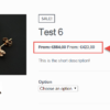
In my setup, I have 3 columns by default, and the theme I used for testing was TwentyTwenty-Two, so the CSS selector is: .woocommerce ul.products.columns-3
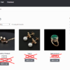
CSS Snippet: Show 2 Columns of Products On Mobile @ WooCommerce Shop
In this case, it’s width: 48% that defines how many columns of products there will be (exactly 2, with 1% margin on both sides). The @media query, besides, defines the target device screen size.
/**
 * @snippet       2 Cols Layout @ WooCommerce Shop
 * @how-to        businessbloomer.com/woocommerce-customization
 * @author        Rodolfo Melogli, Business Bloomer
 * @compatible    WooCommerce 6
 * @community     https://businessbloomer.com/club/
 */

@media (max-width: 767px) {

	.woocommerce ul.products.columns-3 {
		display: flex;
		flex-wrap: wrap;
		justify-content: space-between;
	}

	.woocommerce ul.products.columns-3 li.product {
		width: 48%;
		margin-right: 0;
		float: none;
	}

}
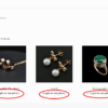
CSS Snippet: Show 5 Columns of Products On Large Monitors @ WooCommerce Shop
In this case, it’s width: 19% that defines how many columns of products there will be (exactly 5, with 0.5% margin on both sides).
/**
 * @snippet       5 Cols Layout @ WooCommerce Shop
 * @how-to        businessbloomer.com/woocommerce-customization
 * @author        Rodolfo Melogli, Business Bloomer
 * @compatible    WooCommerce 6
 * @community     https://businessbloomer.com/club/
 */

@media (min-width: 1200px) {

	.woocommerce ul.products.columns-3 {
		display: flex;
		flex-wrap: wrap;
		justify-content: space-between;
	}

	.woocommerce ul.products.columns-3 li.product {
		width: 19%;
		margin-right: 0;
		float: none;
	}

}


Hi Rodolfo, in woocommerce shortcodes, the columns = “5” parameter works only for desktop, how do we make it work for a mobile?
You can do so with a bit of CSS. Sure you can fit 5 columns on a mobile phone?
This works on the shop page, but it doesn’t work on the homepage where I have the handpicked products. What I did to make it work is change the max-width to 480px, change the class names and add flex:none; to the li item.
Don’t ask me why it works, I’m not a css export, just did some trial and erroring in the browser.
/*also on homepage*/ @media (max-width: 480px) { .wc-block-grid.has-4-columns .wc-block-grid__products { display: flex; flex-wrap: wrap; justify-content: space-between; } .wc-block-grid.has-4-columns li.wc-block-grid__product { flex: none; width: 48%; margin-right: 0; float: none; } }Thank you!
Thank You so much for piece of code!
Thanks to everyone who contributed previously.
Currently, the products on mobile are forced to stack. Just force it to display as mobile by adding !important to the flex parent as in: display: flex !important;
/*also on homepage*/ @media (max-width: 480px) { .wc-block-grid.has-4-columns .wc-block-grid__products { display: flex !important; flex-wrap: wrap; justify-content: space-between; } .wc-block-grid.has-4-columns li.wc-block-grid__product { flex: none; width: 48%; margin-right: 0; float: none; } }Cool, thank you!